1 How to Make a Quick Pie Chart in Excel2 How to Label a Pie Chart in Excel3 How to Customize a Pie Chart in Excel4 How to Explode a Pie Chart in Excel5 How to Create a Pie of Pie Chart6 How to Create a Bar of Pie Chart7 Extra: How to Make a Bar Graph in Excel8 Extra: How to Find Duplicates in Excel Data and Remove Them
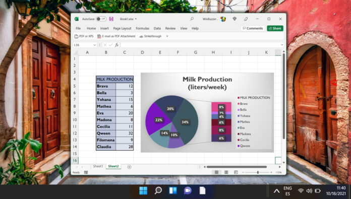
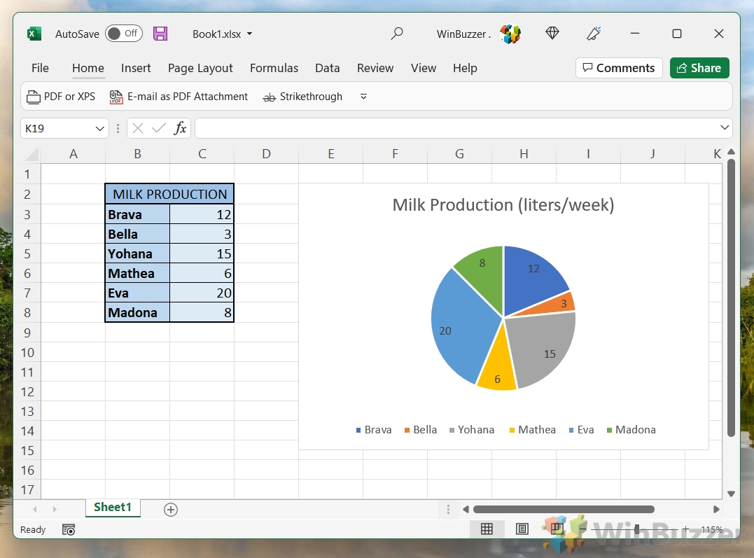
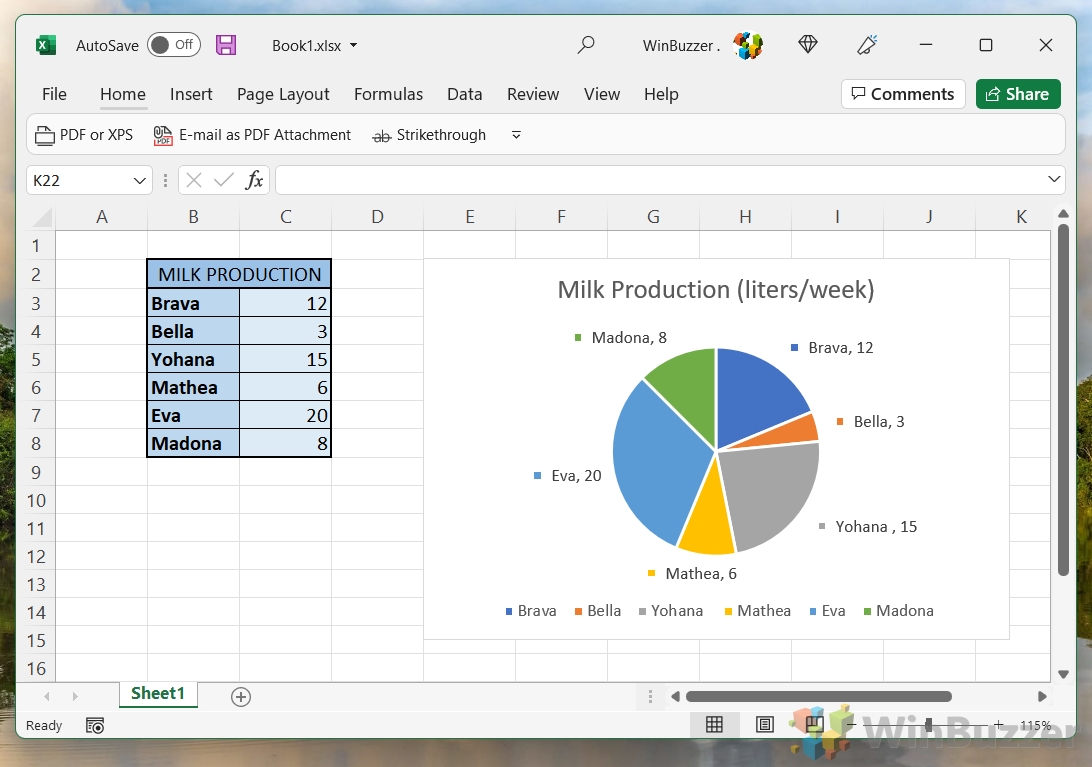
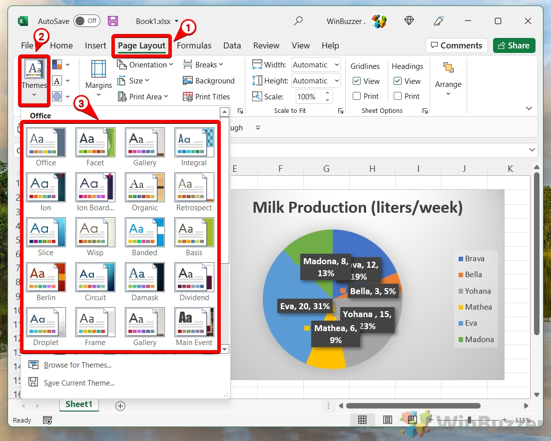
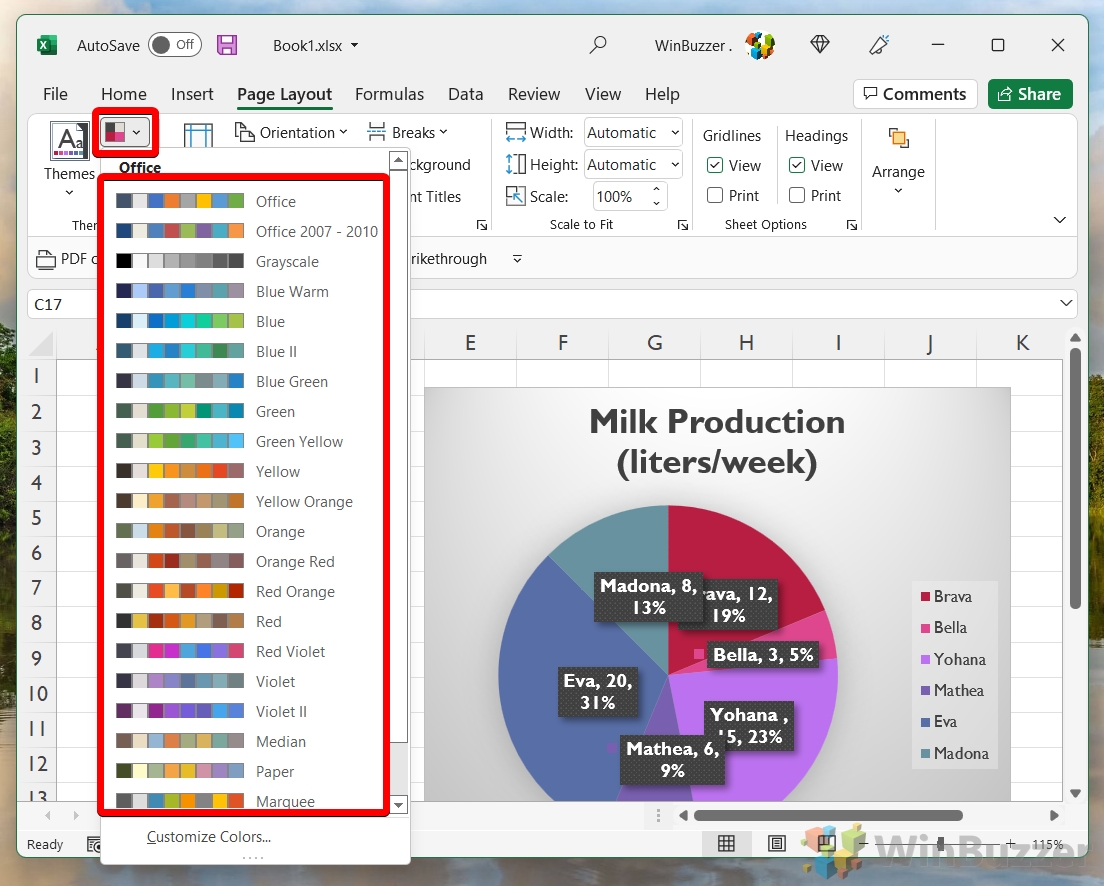
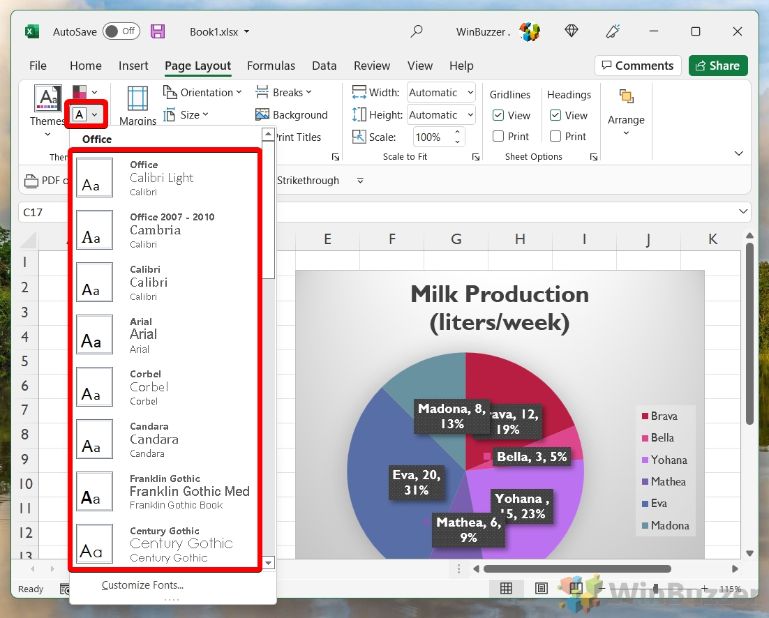
How to make a pie chart in Excel: There are different ways We’ll first look at creating a basic Excel pie chart, then move on to adding labels, customizing its visuals, exploding the pie chart, and finally creating a pie chart with a bar chart to the side. Before you put the time in to make a pie chart in Excel, do bear in mind that you can only display a single data series in one and are unable to use zero or negative values. If your data set doesn’t fit those requirements, you may be better served by our bar chart tutorial, which is linked at the bottom of the page.
How to Make a Quick Pie Chart in Excel
How to Label a Pie Chart in Excel
How to Customize a Pie Chart in Excel
How to Explode a Pie Chart in Excel
How to Create a Pie of Pie Chart
How to Create a Bar of Pie Chart
Extra: How to Make a Bar Graph in Excel
If you realized that a pie chart doesn’t really work with your data set, chances are you can’t go wrong with a trusty bar graph. We even have a dedicated bar graph in Excel guide to help you make one.
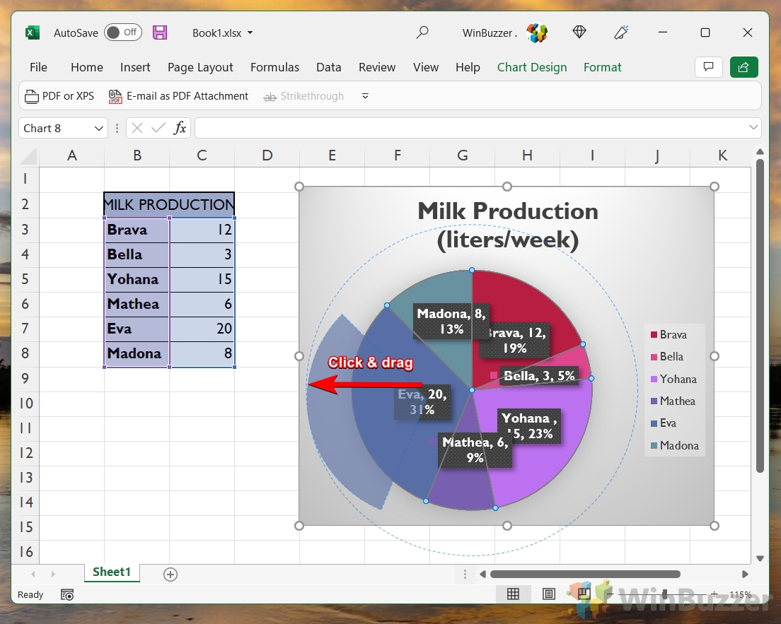
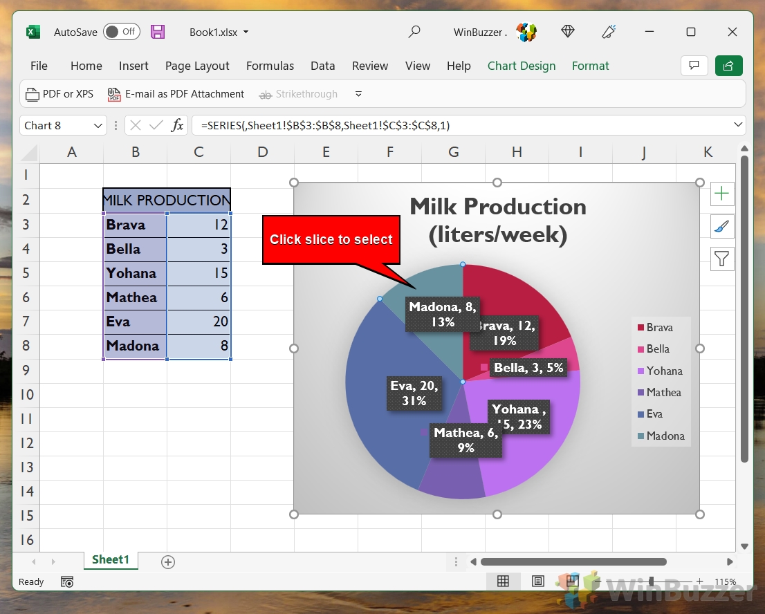
You can repeat the process for each slice in your pie or leave it as-is if you want to highlight a particular result.
Extra: How to Find Duplicates in Excel Data and Remove Them
If you noticed that you’ve entered the same data multiple times after creating your pie chart (a common mistake) you can try some of the formulas in our how to find duplicates in Excel guide. They should get rid of them and save you a lot of manual deletion.
