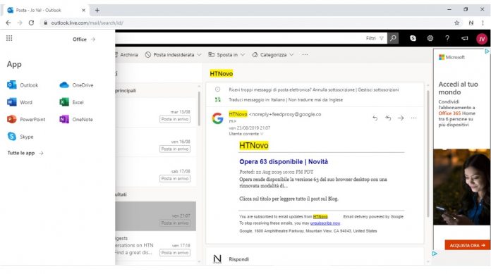
If you are unfamiliar with Fluent Design, it is Microsoft’s universal design language that it uses across its services. Fluent Design is an evolving UI that Microsoft will add to over time. In terms of Outlook.com, Microsoft has added new icons based on Fluent Design in the main menu of the website. Further design changes away from Fluent Design have also been made. For example, Microsoft says the “New Message” button no longer includes the + symbol and has a new color background. While these changes are now available, Microsoft is rolling them out in stages. That means some Outlook for web users already have the new design elements while others will have to wait. We expect all users will receive the new web experience before the end of this week.
New Outlook.com
Earlier this summer, Microsoft rolled out its new Outlook for web experience to all users. Originally announced at Ignite 2018, the overhaul of Microsoft’s email service on browsers has been in preview over the last eight months. There are plenty of new features in Outlook on web. Microsoft has made easier to find emails through a new Categories submenu. Users can create categories and search messages within them. Outlook on the web now also has Microsoft’s Dark Mode, a darker hue that the company has spread around many Windows 10 services. The website now also supports emojis and GIFs, which can be added straight into emails.


