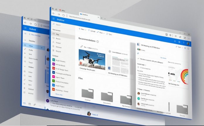
When launched last year, Microsoft said Fluent Design was an evolving and perpetual aesthetic. Extending beyond Windows 10, we are seeing how Fluent Design has influenced the company’s new Office icons. We reported earlier this week how those Office icons are a precursor of new icons for Windows 10 apps. Microsoft Office UX chief John Friedman authored the post announcing new Office icons and teasing the new Windows icons. Now, the executive has spoken to The Verge and explained how design is becoming universal across Microsoft services. Friedman says the company now sees design as an “internal open source team” where divisions work in unison to create a uniform aesthetic. That won’t stop Fluent Design from evolving but will ensure services are in sync with design elements. To achieve this goal, Friedman is working in collaboration with Albert Shum of the Windows team and Ralf Groene from Surface. “This is definitely a cross company effort. We operate like an internal open source team. So, we’re all openly sharing our design work, critiquing the work, working on it together. What we’ve found is that the best way to develop our Fluent Design system is to truly open source it internally. What’s happened is that we’re getting the best of everyone’s work that way.”
Learning from the Past
Microsoft attempted to make wholesale changes to the look and feel of Windows with Windows 8. It was a disastrous decision as users largely turned away from the new aesthetic and mostly hated the platform. Windows 10 rectified many of the mistakes made in Windows 8, while retaining some of its positives. Friedman insists such widespread changes will not happen again, but Fluent Design will remain fluid in incremental changes: “If we have to change everything at the same time, it will never happen. We’re highly coordinated internally, so the Office designers know exactly what’s coming next with Windows. The Windows designers know exactly what’s coming next with Office.”


